Tableau: AFDB Market Trends with Viz. Part 1

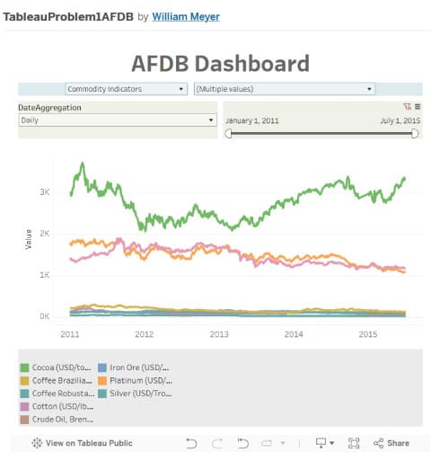
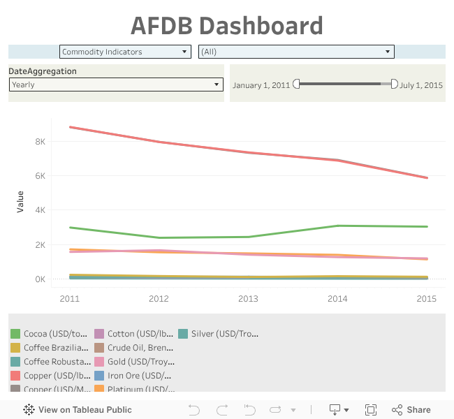
I have embedded the visualization of the AFDB Market Trend dataset below. Tableau dashboards seem to work flawlessly on desktop, but often have trouble on mobile displays. I will include screenshots, and the direct link to the dashboard on Tableau Public can be found here.
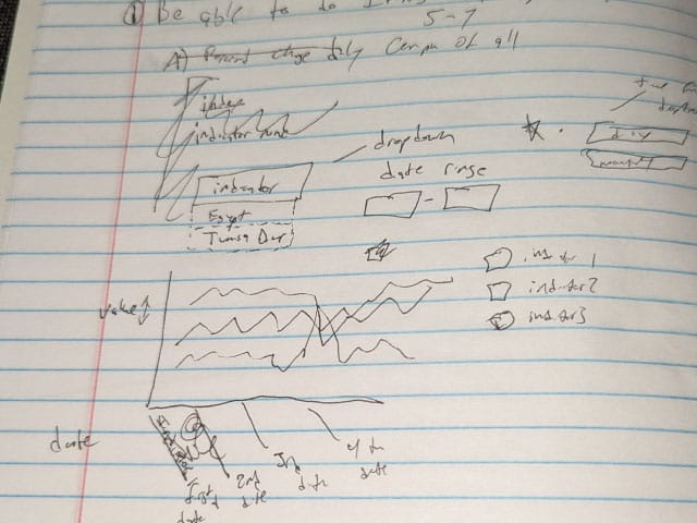
In order to turn this draft into a working dashboard I considered a few steps then began to create the table.
- I imported data and made sure the data types were correct.
- I placed the 'date' variable in the columns, and the 'value' as the rows.
- On the Graph itself I placed the 'Indicator Name' as I wanted to be able to display each indicator's value's separately as opposed to aggregating the value for all indicators.
- I created a filter for indicator name, so the user can choose which indicator(s) they would like to see.
- The SUM(value) was changed to average (for future aggregations, by month or quarter, etc)
- A calculated field was created to filter out commodities (
IF ISNULL([Unit]) THEN 'Main Indicators'
ELSE 'Commodity Indicators'
END
- Make sure the indictor filter is affected by the 'commody indicator', else it will show all the indicators even when just 'commodies' or just 'Main indicators' is selected.
Before: